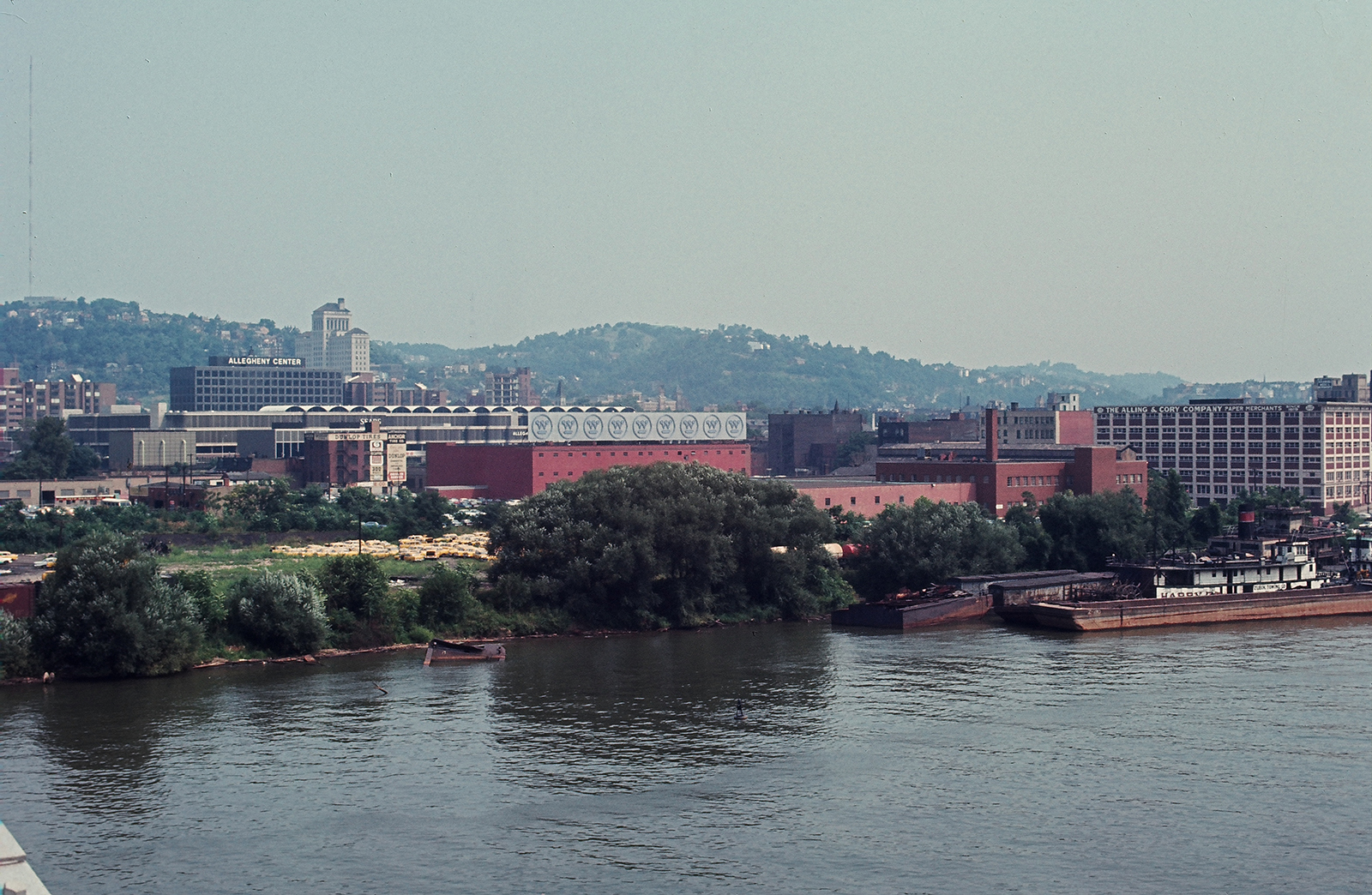
The big electric-blue display that crowned Pittsburgh’s North Shore for over 30 years was more than just a billboard. It was a declaration that good design is good not just for business, but for all of us.
How could that be? To find out, you’ll need a little background: The Westinghouse sign was what the outdoor advertising industry calls a “spectacular”—an oversize and technically complicated installation. Mounted on a rooftop and facing the Allegheny just upriver from Point State Park, it was a narrow band of neon, 200 feet long and a tad less than 18 feet high. That’s roughly the profile of four boxcars, handy examples of which continually rolled along the Norfolk Southern Railway tracks behind the gritty brick building that supported the sign.
It was cool. It was abstract. No company name, no slogans, no time and temperature. Just a row of nine identical “circle Ws” rendered in a total of 3,000 feet of glass tubing. In Pittsburgh, you didn’t need to be told what they stood for.
When the sun went down the logos would dance, fragmenting and reconfiguring hypnotically. Their straight lines, dots, round-ended bars, and circles (81 components in all) flickered on and off independently in a shifting, animated ballet.
Local legend held that the computer (a futuristic touch in itself, ca. 1967) controlling the seemingly endless random patterns could run for hundreds of years without ever repeating. In reality, the program cycled through 120 sequences every six minutes. Westinghouse designers occasionally introduced new combinations to freshen up the show.
With or without the infinite variations, on a mild summer night with a calm stretch of river as a reflecting pool, watching the sign was like listening to the Modern Jazz Quartet.
But what possessed the pragmatic engineers and scientists who ran Westinghouse back then to subsidize this playful sculpture? The investment was non-trivial. Although no record of the 1966 budget survives, a spokesman for the North Shore Neon Sign Co., in the borough of Queens, estimated that replicating the sign today would cost more than $2 million. And he figured the original sign’s power consumption at a hungry 500 amps, enough to supply 100 Pittsburgh-area homes.
Which begs the question: What led to the sign’s creation? Well, as the 1960s dawned, corporate values remained stolidly utilitarian, as they had been in 1886 when Westinghouse Electric was born. The default color scheme? Bright gray. But elsewhere in the business landscape, renaissance moments were unfolding.
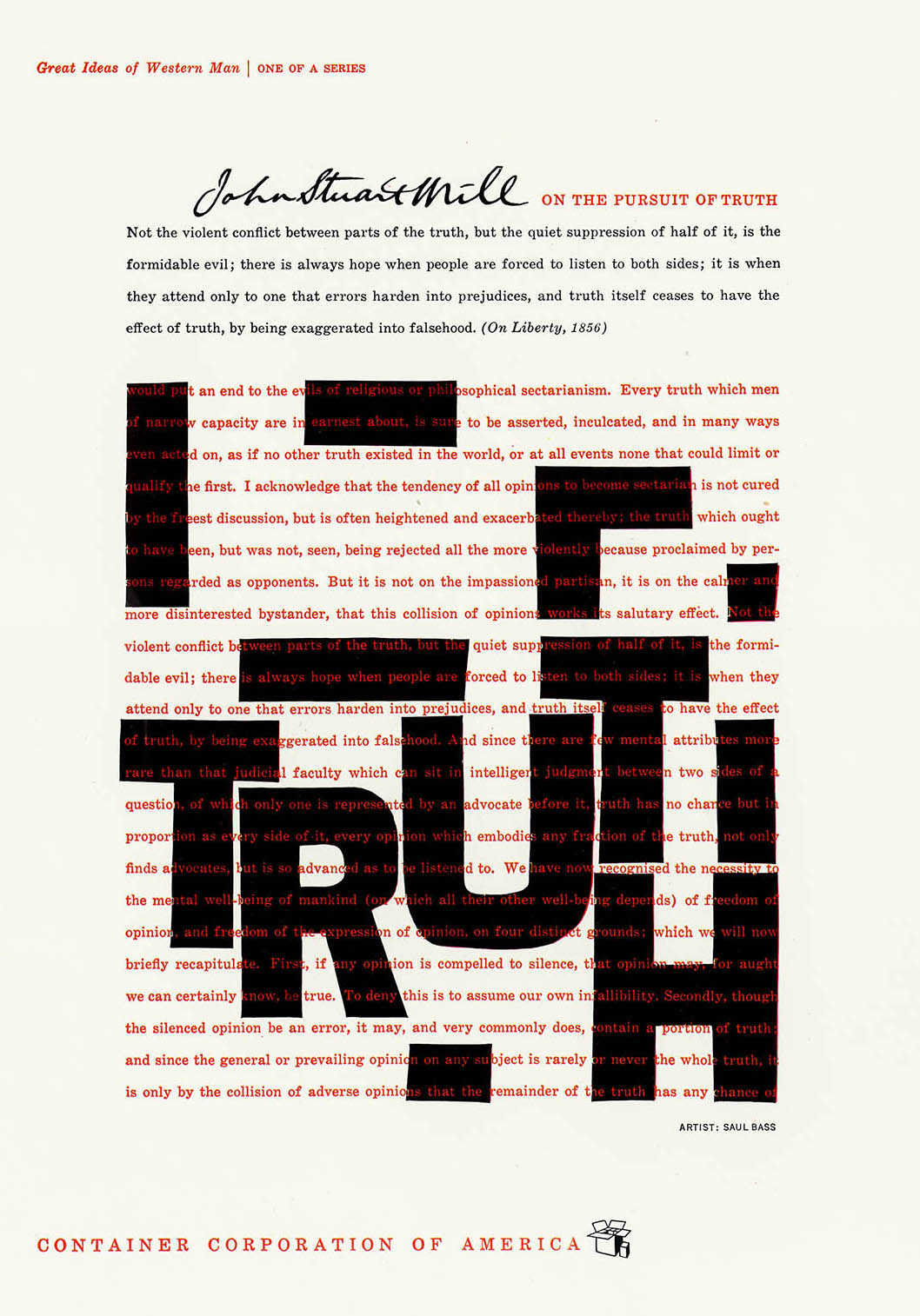
Container Corporation of America, for example, was espousing “design excellence” with its modern-art flavored “Great Ideas of Western Man” ad campaign, which featured contributions from such design luminaries as Saul Bass, Ben Shahn, and Milton Glaser. General Dynamics was commissioning stylish posters that quickly landed in the white-walled galleries of New York’s Museum of Modern Art (MoMA). With “Good design is good business” as their battle cry, IBM president Thomas Watson, Jr., and design consultant Eliot Noyes had launched an all-encompassing corporate modernization program. (A respected architect and former MoMA curator, Noyes was also known as the designer of the IBM Selectric typewriter.)
And at Westinghouse, anything seemed possible, from nuclear power for submarines and radar for guiding spacecraft, to video cameras that soon would document the first manned expedition to the moon.
Incoming Westinghouse CEO Donald Burnham, who served from 1963 to 1968, wanted to transform the company into an integrated techno-conglomerate that could do good in the world and make money while doing it. He envisioned an enterprise that would, as the Pittsburgh Post-Gazette said, “make the power plants, circuit breakers and transformers that brought electricity to the home—and the dishwashers, stoves, TVs, radios, air conditioners, furnaces, lights and lamps that consumed it.”
Accompanied by Eliot Noyes, Burnham had visited the Turin, Italy, home of Olivetti, a humanistic maker of typewriters and other business devices that’s still famous for its consistent excellence in product design, graphics, business interiors, and factory architecture. Burnham came home convinced that a better-designed Westinghouse would be a more successful Westinghouse.
But what did he mean by “design”? Contemporary statements by Noyes outline a far broader agenda than just making things pleasant to look at. Far beyond consistent, tasteful signage, advertising, and packaging; beyond functional, safe, user-friendly products, the whole enterprise—people, processes, culture—would, ultimately, be integrated into one giant, dynamic composition. An idea ahead of its time, but only just. It’s a line of thinking that leads directly to the Genius Bar in your neighborhood Apple Store.
Soon an in-house film producer named Richard Huppertz would be drafted to facilitate Burnham’s vision. In 1959, Ketchum, MacLeod & Grove, the agency handling Westinghouse’s advertising, had already pointed out that Westinghouse’s image—as expressed in business paper, products, vehicles, plants, and signs—was inconsistent, tired, and out-of-date. A unified modern look, Ketchum suggested, was long overdue.
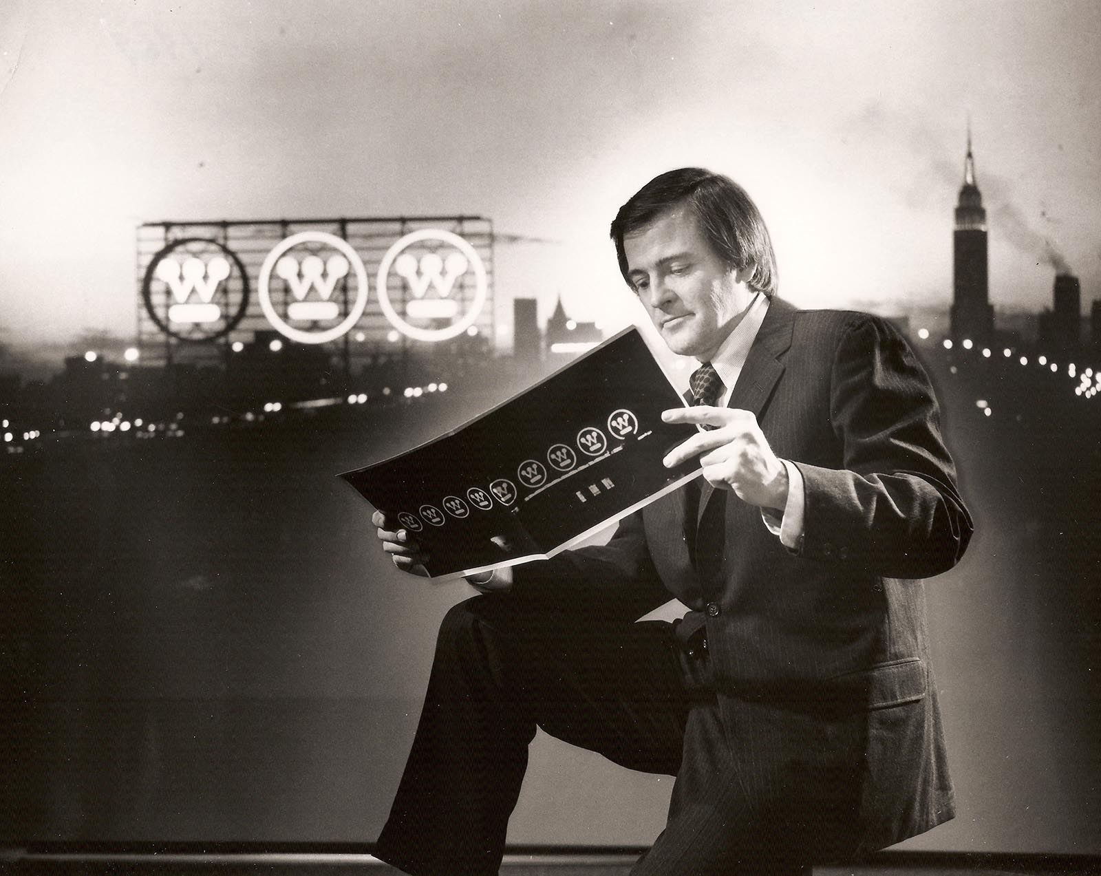
Hard-nosed executives demanded evidence. Huppertz had filmed dozens of Westinghouse locations across the United States, so he was tapped to conduct a visual survey. He spent months on the road shooting “architecture, interiors, graphic design, product design, everything,” he recalls. Then he edited the footage into a presentation called “Image by Design.”
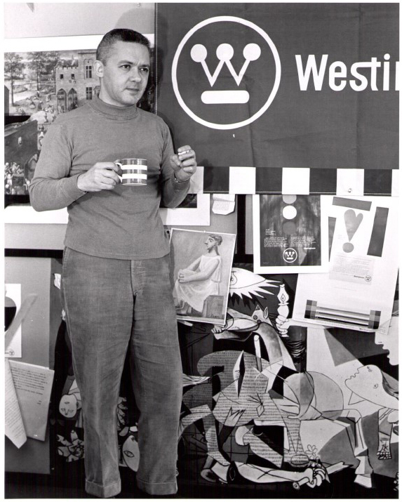
The decision makers were convinced. On Noyes’s recommendation, Westinghouse asked Paul Rand to develop an engaging, modern graphic identity. Possibly the 20th-century’s most influential graphic designer, Rand had gained C-suite credibility when he modernized IBM’s logo in 1956. Rand was the right choice for Westinghouse; after almost 60 years, the minimalistic, timeless identity system he designed is still widely recognized and successfully applied.
Rand scored further Westinghouse assignments, while the company retained Noyes as its consultant director of design. Huppertz, by now promoted to in-house corporate design coordinator, spent his days collaborating with Rand and such now-revered modernist icons as Charles Eames and Herbert Matter.
Word got around that good design had value, and that corporate headquarters was offering professional assistance. A scattering of business units, plants, and offices—typically wary of advice from Pittsburgh—solidified into a client base for Huppertz (still the sole in-house design practitioner) and his consultants. “Some were receptive, but others thought it was just a lot of malarkey,” Huppertz concedes.
In any case, by 1966 the Rand circle-W was accepted (if sometimes grudgingly) throughout Westinghouse. It seldom appeared on anything more sensational than a light bulb or an annual report.
Huppertz, seeking consensus-building exposure, had an inspiration: A homely orange-and-blue neon sign had for decades announced, “You can be sure … If it’s Westinghouse.” from the roof of the Westinghouse Electric Supply Co. (Wesco) building on the Allegheny River. Visually, it was an outmoded relic. With Rand’s help, he could repurpose the installation into a dynamic but understated showcase for the modern symbol. Burnham and his management team signed off on the idea, Rand got to work, and in 1967 the elegant nine-symbol display made its debut. Among downtown workers, recreational boaters, and tourists its witty, contemporary style scored an instant hit.
By now, design consciousness and what one observer called “simple good taste” were woven into the headquarters culture. Just before an army of executives, managers, and support staffers moved into the newly constructed, 23-story international style Westinghouse Tower at 11 Stanwix Street in downtown Pittsburgh, top management approved another Huppertz proposal.
Finally he had the green light to assemble and manage an in-house Corporate Design Center. Over the next few years his staff grew to occupy the building’s entire 11th floor. As its capability brochure noted in the early 1970s, the Design Center offered resources and expertise to any Westinghouse operation interested in “good, functional designs and a unified and contemporary appearance for all products, buildings, and graphic material.”
The Design Center did solid work. Its staff contributed architecture and interior design expertise to many innovative Westinghouse buildings and spaces across the U.S., including the original Westinghouse Nuclear Energy Systems Headquarters building in Monroeville, Pa., which is now available via Oxford Realty Services. Among the center’s memorable graphic-design outputs were classically clean, crisp annual reports and graphic standards guides. Its industrial design team pioneered light-rail concepts that found their way into San Francisco’s BART system and the Pittsburgh International Airport’s “people mover” subway.
Elsewhere in the building, every public space, hallway, and conference room was a model of interior design, in the manner that today we describe as midcentury modern. Office workers who didn’t know Charles Eames from Charles M. Shulz learned to appreciate furniture manufactured by the trendsetters at Knoll, Inc., and designed by the likes of Marcel Breuer, Eero Saarinen, and Hans Wegner.
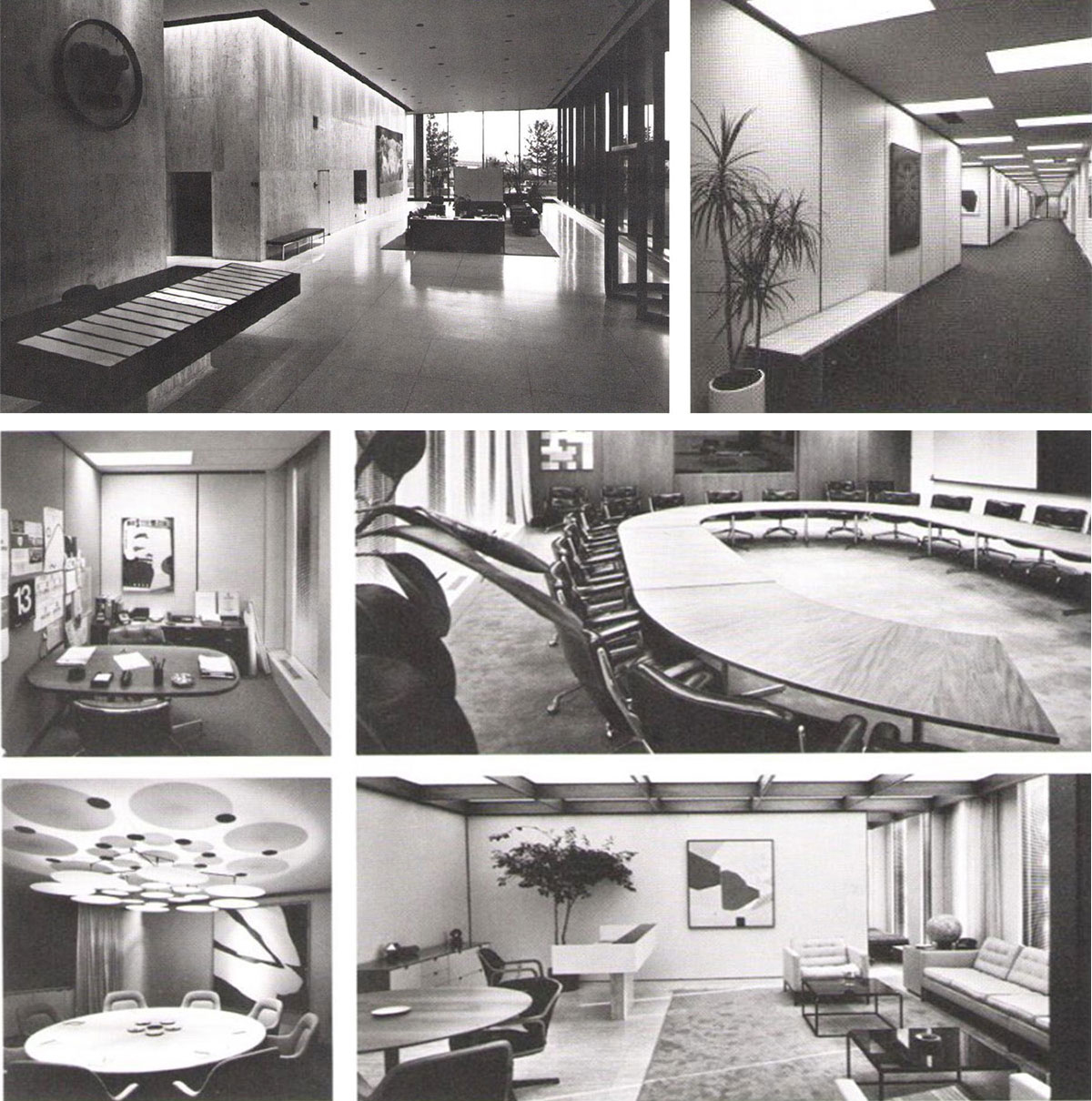
The attention to detail was almost preposterous. A secretary could touch-type memos on an IBM Selectric typewriter that was equipped to print, in a single keystroke, a tiny circle-W. The Selectric, as noted earlier, was an Eliot Noyes design.
Light Up, a monumental, chrome-yellow sculpture by Tony Smith, stood like a triumphal arch at the building’s main entrance. Embellishing elevator lobbies and offices were original works from a collection of approximately 2,000 prints, paintings, sculptures (mostly modern, of course), and tribal artifacts. An in-house curator visited all new hires who rated private offices (as so many did) and invited them to select pieces for coffee-break contemplation. Perhaps a DeKooning, a Sam Francis, a Frank Stella? An Ernest Trova, a Barbara Hepworth, a Henry Moore?
This was more than an office building. This was a civilization.
But everything, they say, comes with an expiration date. As the Burnham era waned, its humanistic, patron-of-the-arts mindset yielded to harsher fiscal realities and a more pragmatic management style, as detailed in the Pittsburgh Post-Gazette’s special report, “Who Killed Westinghouse?”
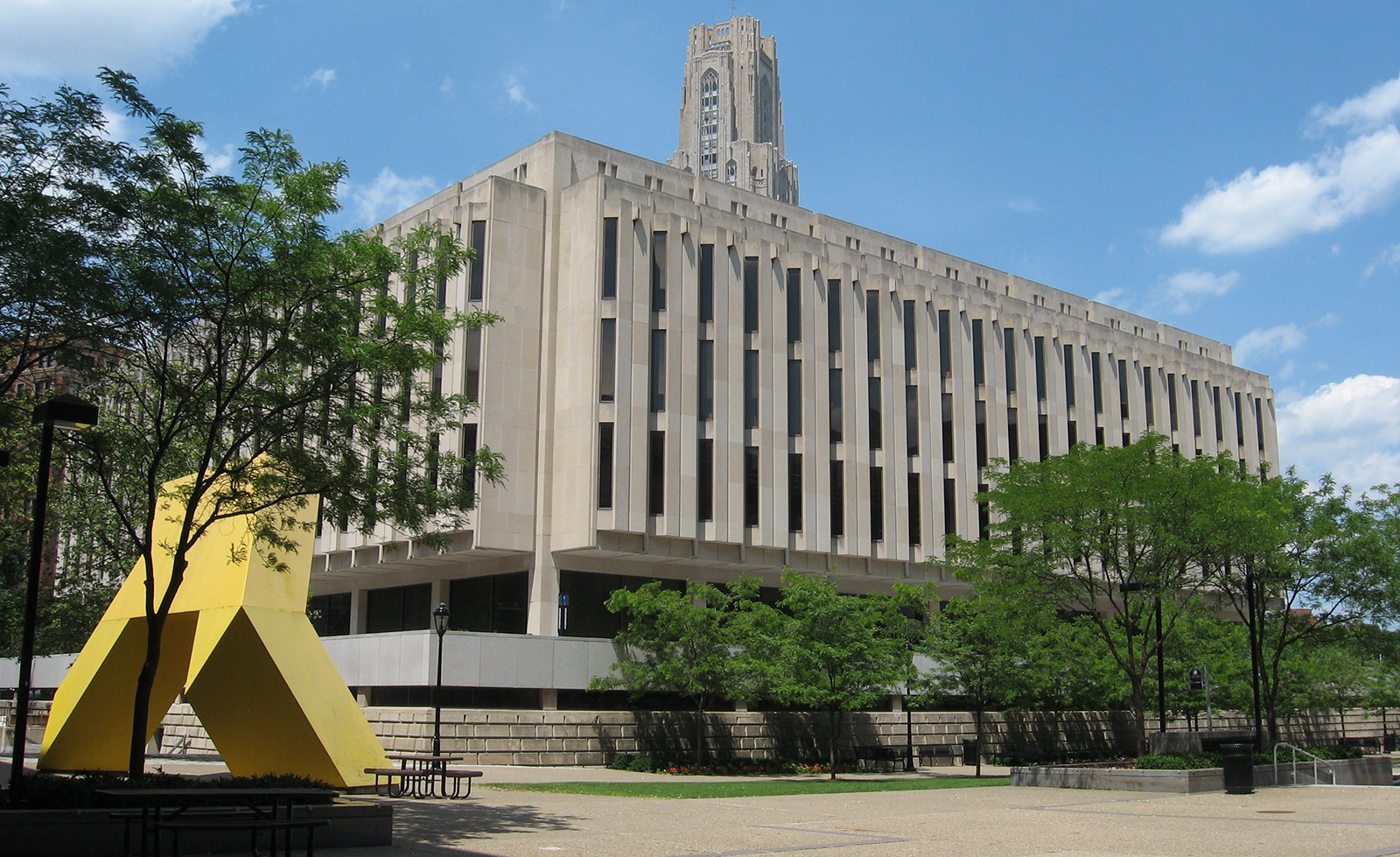
Eventually, the Design Center closed its doors, with many alumni going on to open successful consultancies of their own. Light Up, to which skeptical managers had attached an epithet too coarse for mention here, was dismantled and hauled away. Most of the art collection was auctioned off. The modernistic furniture and the Selectric typewriters still turn up occasionally on eBay or at estate sales.
Richard Huppertz joined Saul Bass, of “Great Ideas of Western Man” and movie-title fame.
The nine-logo sign was the last holdout. It winked and jiggled faithfully until the fall of 1998, when the Wesco building was razed to make way for PNC Park. And that turned out to be something of a design icon itself.
George Heidekat
Having wandered the halls of the Carnegie Museum of Art since I was knee-high to a Congolese nail figure, I’m delighted now to be published in the Carnegie Museum of Art Blog. Ordinarily I’m a private scribe. That means people hire me to help them explain all kinds of things more clearly: science and technology, higher education, medical research, sometimes even design. Before I launched Heidekat Writing Services a dozen years ago, I cogged in the machineries of ThoughtForm Design, the Software Engineering Institute, and, of course, the Westinghouse Electric Corp. My collection of mid-century modern artifacts is in dire need of curating.
Archival video of the iconic Westinghouse sign is part of the exhibition Hot Metal Modern: Design in Pittsburgh and Beyond, currently on view in the Charity Randall Gallery at Carnegie Museum of Art from September 26, 2015 to October 2, 2016. To learn more about this period of sweeping change in the city’s history, visit the Pittsburgh Modern story archive.
This essay was a finalist for a 2016 Golden Quill Award recognizing excellence in regional journalism.